In this article, we are going to learn about PowerApps canvas app components, how to create components, how to create custom input and output properties in components.
Definition: Components are the reusable building blocks that you can create whenever you feel there is a need of using similar things multiple times.
- Canvas components can also be used in model-driven apps using custom pages and component library.
- You can create and use components within an app or across the apps (in different apps) using component library.
- Components are very useful especially while building large apps having similar pattern of controls. If you update a component, the change will reflect at all the places where it is used.
- Components also reduce duplication of efforts by eliminating the need to copy/paste controls and improve performance.
- Components help in standardizing look-and-feel across the organization using component library.
- Use acomponent librarywhen creating components for reuse.
- Updating components inside an app only makes the component updates available inside the app.
- When using a component library, you get prompted to update components if components inside a library are updated and published.
How to create and use Component in PowerApps – Canvas app?
- Edit your canvas app.
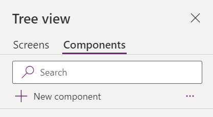
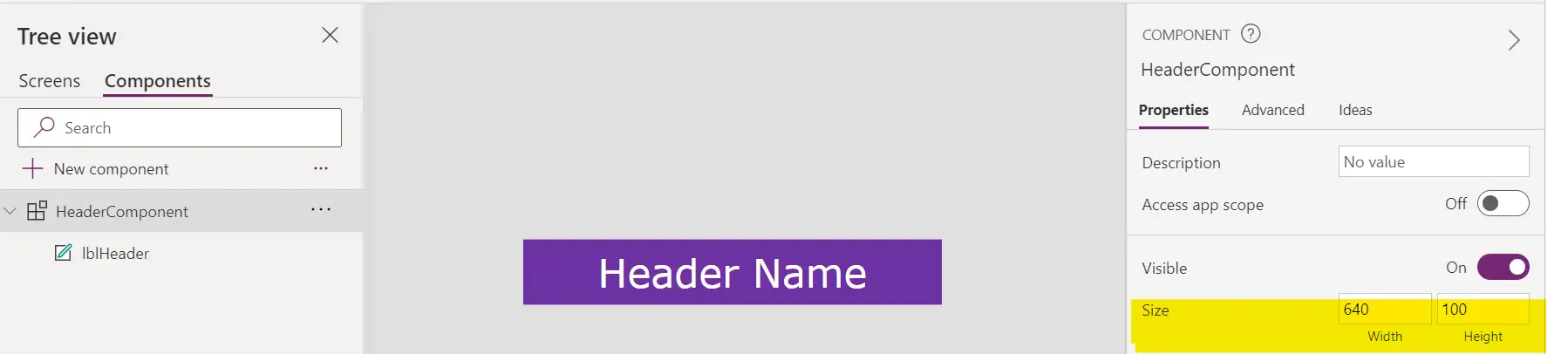
- Click on the New component from Components tab in left hand side Tree view.
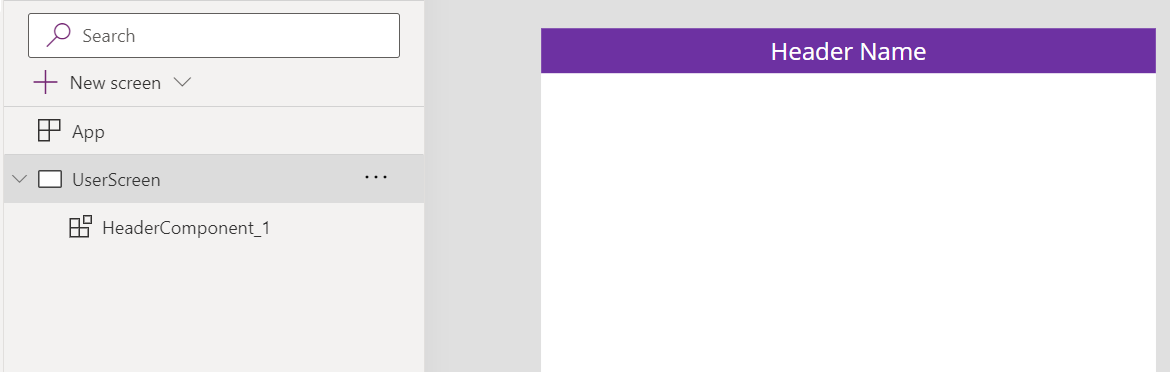
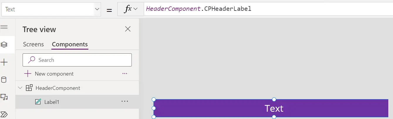
- Add a header label in the component. The idea is that this header will be available throughout the application, and we wouldn’t need to keep adding Header label in each screen.
- Now go the screen where you want to use this label. Click on Insert >> and search for component that you have created.
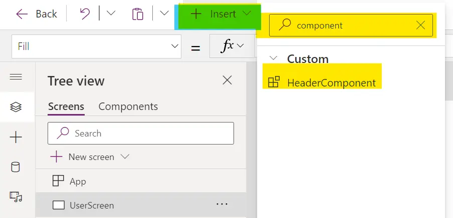
- Once you click, it will be added on the screen.
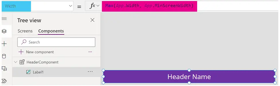
- Here, one thing we need to keep in mind is that width of the component. You can write a formula like this.
- Width: Max(App.Width, App.MinScreenWidth)
Custom properties in Canvas app components
Take example of above scenario, what if you want to change the name of the header label in each screen, how will you do it? Custom properties come to your rescue.
- The component can receive input or emit output using custom properties.
- These properties are visible in component’s property panel and can be configured the same way we configure properties for any controls.
- Go to the component that you have created.
- Click on New custom property from the right-side properties panel.
- There are some attributes for new property that you need to fill in.
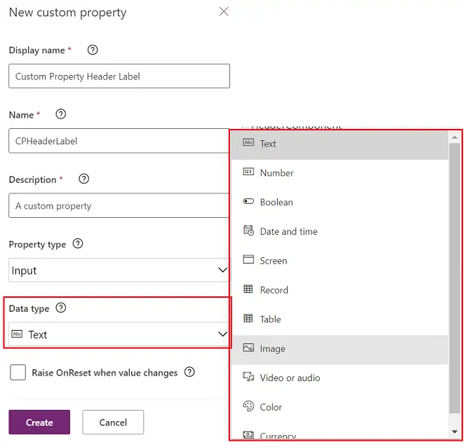
- Display name: This name shows up in the properties panel.
- Letters, numbers, and special characters are allowed.
- Descriptive display names help convey the purpose of the property to whoever reuses the component. For instance, "Custom Property Header Label".
- Name: This name is used when referencing the property inside formulas.
- For example, "MyComponentName.MyPropertyName".
- The name must contain only letters, digits, or underscores, and be unique for the given component.
- Description: This content will help whoever uses the component to understand its purpose.
- It will show as a tooltip in the properties panel.
- Property type: A custom property can either be an input property or an output property. In this example we are going to use Input property.
- Input properties allow components to receive data from the app, whereas output properties allow components to emit data to the app.
- Data type: Please select the desired data type for the custom property.
- A default value will be assigned for the property based on the data type.
- After creating the custom property, you can change the default value via the formula bar or advanced panel.
- Raise OnReset when value changes: If turned on, the component's OnReset behavior will run when the input property's value changes.
- For the component text property, write like this. Here inn formula, HeaderComponent is component name and CPHeaderLabel is Property name
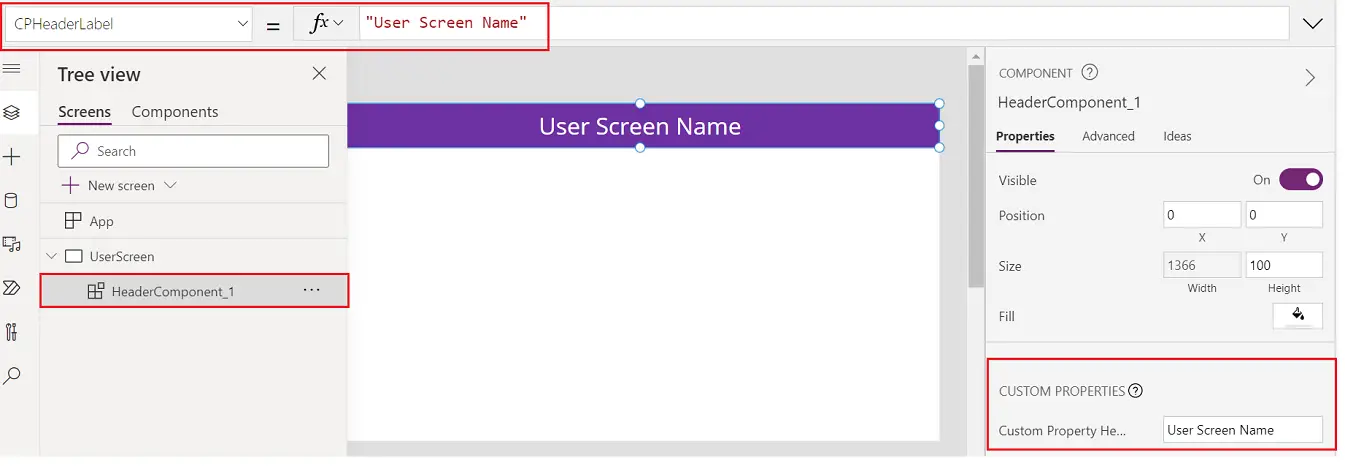
- Now, go to the screen where component is used and change the text of the header from the property panel as shown in the screenshot.
- That’s it, Done!
How to create and use new custom property of Output type?
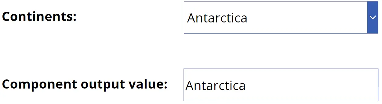
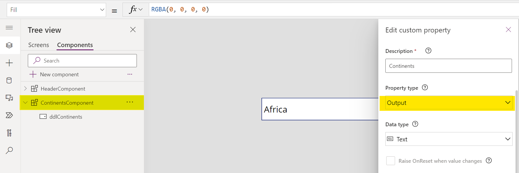
- Create a component with a drop-down list. We will keep all the continents in this drop-down list. This is just a sample example.
- As you can see this is an output property.
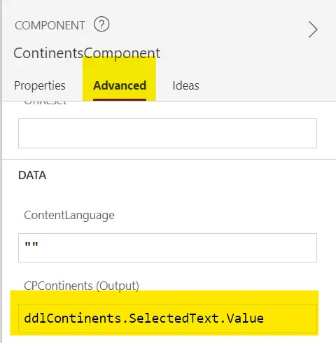
- Now we need to set the output value. Select the component and go to the advances tab. In The (Output) attribute, specify the output value that you want.
- Now open your screen and place this component there. Along with component, keep one label control also so that output control can emit the data and label control can use it.
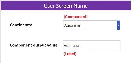
- For Label control, text property, use this formula.
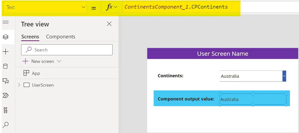
- The value we select in Component drop-down will be listed in the label control below.