In this article, we are going to learn about component library, how do we create it and how we can add a component within an existing component library.
What is component library?
A component library is a set of components within the PowerApps that can be shared and reused across different applications. The components in a component library can range from simple UI elements such as buttons and text boxes to more complex components that provide specific functionality such as data visualization or custom forms.
Notes:
- When you use components in any app, the app maintains dependencies with the component.
- The app owner will be alerted when there is a change and new version of the component is available.
- The component library is different from the component framework. Component framework allows developers to create code components for canvas app and model-driven app.
- Component libraries are the containers of component definition and because of that it is easy to:
- Search components
- Publish the updates
- Notify app maker/owner about available component updates
What is the difference between an app and a component library?
- An app is a standalone software application that is designed to perform a specific task or set of tasks for a user, while a component library is a collection of reusable UI components that can be used to build multiple apps.
- A component library provides a set of pre-built, tested, and documented UI elements, such as buttons, forms, icons, and more, that can be easily integrated into an app to reduce development time and improve consistency. In short, an app is the end product, while a component library is a tool used to build that product.
How to create a component library?
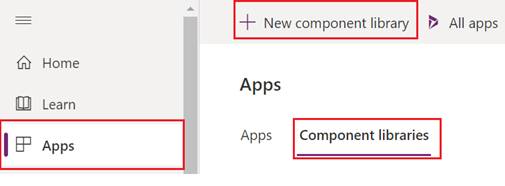
- Go to https://make.powerapps.com/
- From left side panel, click on Apps.
- On the right side, click on Component libraries >> New Component Library.
- It will ask to create a component. Create a component >> publish it and it will be saved in this component library.
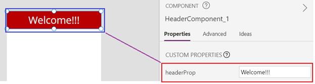
Custom Property in Component library
- Additionally, we have created a custom property also, which we will update while consuming this component within an app.
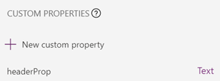
- Text of the header is configurable by the custom property.
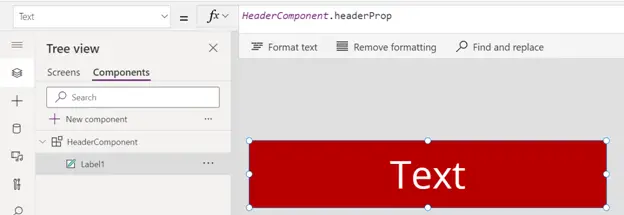
Library component customization
- If you want some flexibility of allowing the component to be edited in the consuming app, you can check out this option in the component library.
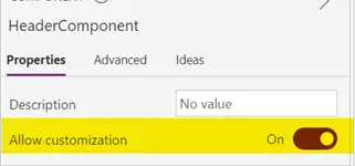
- By default, this is On, if you make it Off, you will not be able to modify the component from the app
How to use a component from component library?
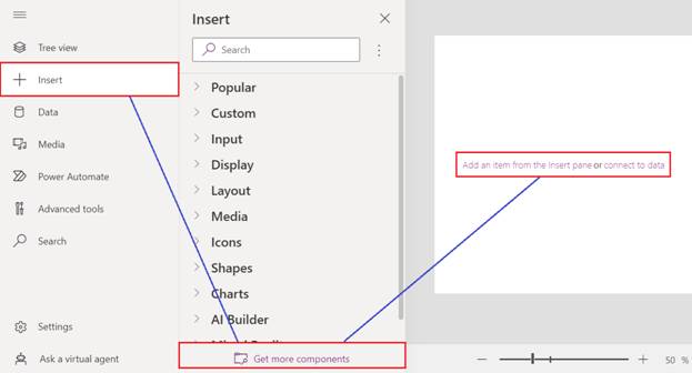
- Open your app in edit mode.
- Go to components, click on Insert >> Get more components
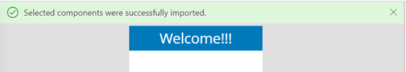
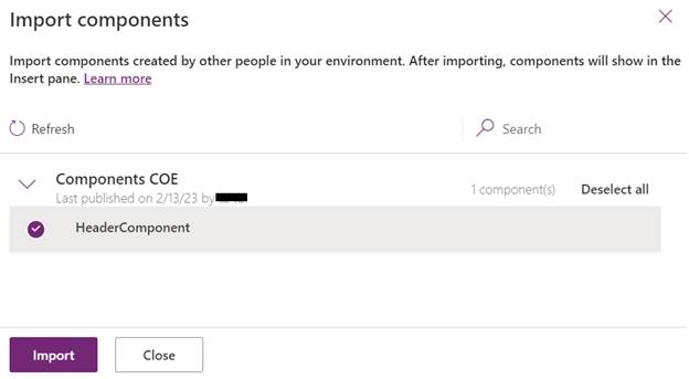
- Select the component that you want and click Import.
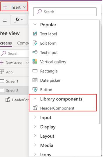
- You can see new component added inside Library components group.
- Change the custom property value – we had created a custom property for header. Now you can change the value.
- Customize the Component – You can also change the properties as we have kept the Allow customization option On in the component library.
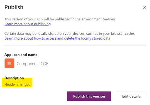
Update Component Library
- When you publish the updated component library, make sure to publish with proper description so that when the app owner gets the latest updates, he knows what exact change he should expect.
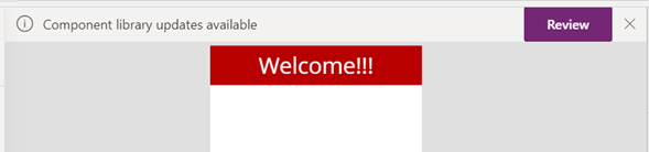
- You will get a notification at the header part of the app.
- Click on Review and then Update.
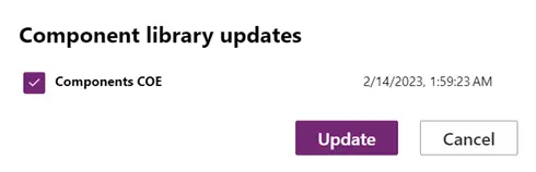
- Bingo!!! Its updated.